Retail Windows that Get Noticed
I’m working on a presentation for a Business Community and it really doesn’t matter if it’s a Clothing Store, A Bank, a Travel Agency or others. The message I would give them would be the same.
You must ensure that your store front and windows portray what your business, it’s strategy and brand stand for. Anything else is counter productive!
Two to Three Seconds to make an impression
That’s all the time you get to get new customers in the door. The time it takes to drive by or walk by…you can count the seconds yourself.
Your store front has to:
1. Catch their eye
2. Send a Simple Single Message
3. Give a compelling reason to stop
4. Lure them into an in-store visit.
If you know your Strategy and Target Market then the window and store front message will be designed to appeal only to that target market segment.
For example, If you’re an upscale Children’s Toy Store, everything about that store front will be designed to entice your target market into your store. Parents, Grandparents and children.
If you’re the new Travel Agency in town, you’ll want to make sure your store front catches your target market; whether it’s an Adventure Specialty or Cruise Specialty or others.
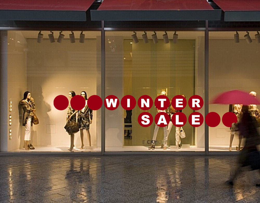
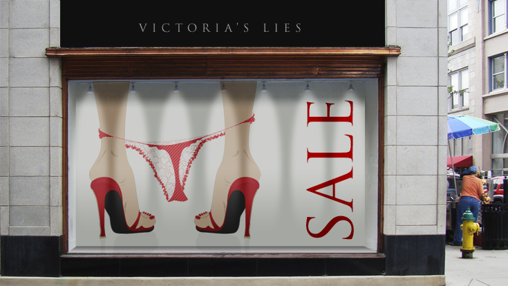
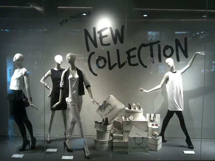
Here are some examples of retail windows! Can you tell the difference?
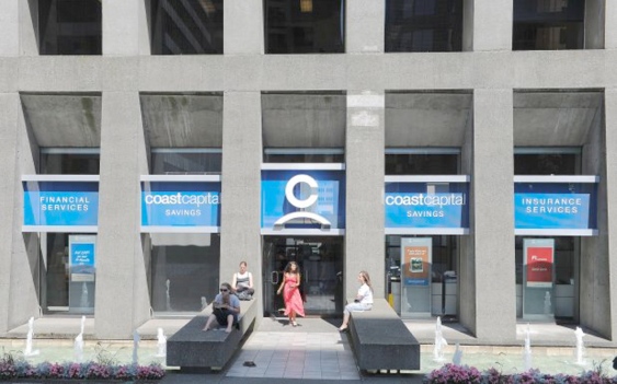
Simple Message in Blue and White. Easy to see from the drive by traffic. Really focused! Financial Services * Savings * Insurance Services
Two to Three Seconds??
We see between 2000 and 3000 commercial messages per day! So, how do we get ONE message across? I look at stores and it’s easy to tell which ones have done the research to reach their target market. It’s very disappointing when people who start out with such enthusiasm end up being so tired that they don’t care anymore. The public notices. Below are two great restaurant examples of restaurants who thought through the whole process.

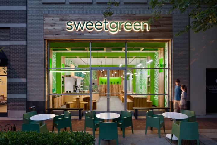
This restaurant storefront is true to it’s brand. Organic all the way! Strong imagery! Great colours. High mid pricing and attracting physically active people who really care about what they eat, and where the food comes from.
The retail window message must be:
1. Easy to see (Glare and Reflection are always issues, Backdrops sometimes help depending on their colour, and sometimes there are barriers to vision – like trees or columns or street posts.)
2. Impactful (Movement, Colour, Light, Size, Bold)
3. Simple (one idea)
We’ve all seen the stores that think they have to have everything in the window, and to tell the whole story every time. The reality is that you need to keep changing the message as people notice change more than anything else.
Just send ONE message
That’s all the customer – your new one – can take in in Two to Three Seconds
Could be:
- Sale (50% Off everything)
- New Item – Latest Electronic Gadget
- Lower Interest Rates
- Fantastic Holiday to Fiji
- Fall Clothing Arriving Daily
- One Benefit – Save, Look Good, Save Money, Buy a Home, …
Action Checklist
This is the most important item…
The more repetitive the traffic, the more frequent the storefront change.
How do I judge the effectiveness?
Stand by/near your store and note shoppers actions.
How far away before they notice your storefront?
Does your store stand out from the neighboring stores or businesses?
Do customers look at the windows? Slow Down? Stop? and Enter?
What does Urban Spaces Design offer?
We are here to help you as a Consultant, A Designer, and Expert in Visual Presentation and Interior Design. With over 20 years experience we know how to “Get People in the Door, and Make you Money” We work with both large Corporations and Smaller Independents. Every business is important to us!
Call us for help. 604 649 9050 or Email info@urbanspaces.ca

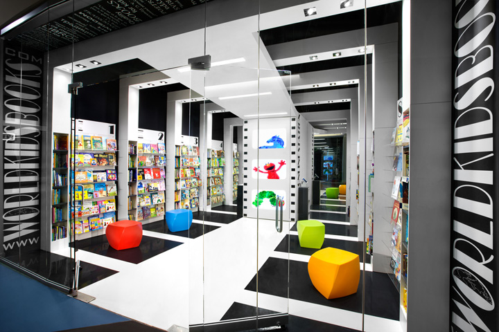
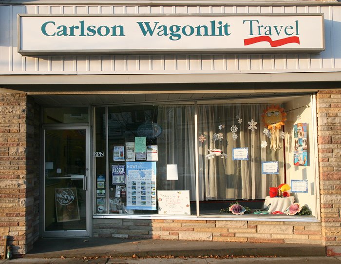
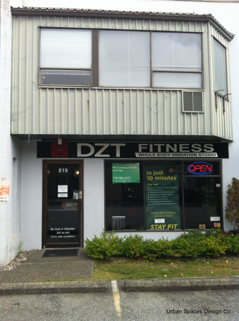
Great points for all businesses to keep in mind. This is especially difficult for businesses located in older buildings. Often the “windowscape” area is limited; perhaps it was never even designed with a window display in mind. Sometimes the building itself is poorly cared for by the owners which may reflect negatively on the businesses within. In the case of the travel company example, the display area is more than adequate but the display is dismal. It suggests they don’t care which could be interpreted as they don’t care about planning your trip. Not the message you want to send! In the fitness company example, it’s difficult to determine what the business is. Besides an unattractive facade, the property is poorly maintained – it’s severely lacking in curb appeal. While this is a term we generally apply to house selling, the lesson is the same. “If you can’t get them interested by the outside, you’ll never get them inside!” Stop treating your business like it’s just the place you go to work. Act like a customer and make an honest assessment of your storefront.
I totally agree Lorri. I like your comment about ‘curb appeal’.