Award Winning High Tech Optometry Office Design
A few short years after designing a new optometry office for my client, they had outgrown it. A space more than double the size of their current one became available and they took it immediately.
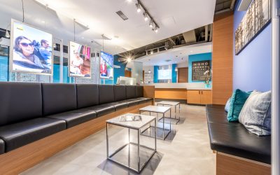
They wanted their new office to be functional and welcoming, but also visually stimulating. One that encouraged optimal flow for the clients, Doctors and staff; one that allowed easy browsing of optical frames, and one which allowed them to showcase their services in a professional way.
The design had to encompass their state-of-the-art diagnostic imaging and technology, their in-house lab, and large selection of brand-name eyewear.
The original space had been designed as an Orthodontics Office. It was full of suspended cabinetry, plumbing and partitions everywhere, an x-ray room and a full kitchen with sterilizing equipment, leaving little privacy for patients. It was dark. The colours were no longer current, and the office felt ‘heavy’ and ‘closed off’.
Renovation Planning and Process
Urban Spaces Design developed the initial open-plan concept including floor plans, fixturing and all finishes; managed all construction permits and the ‘Project’ from start to finish. Finishing on time was critical. Every day that the office would not be open would cause tremendous financial loss. We were very fortunate to have a client who would make quick decisions on any design elements, whether the decision came via email, telephone or on-site.
Two thirds of the way through the renovation the client decided that they could not ‘live with’ the existing limey-green concrete floors. After a presentation of some alternative products, it was decided to resurface them with a grey metallic epoxy urethane floor. This was a costly, over-budget item, but an attractive design change that they are very happy with.
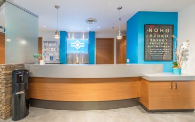
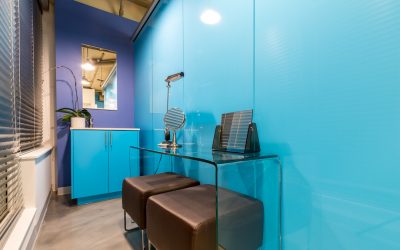
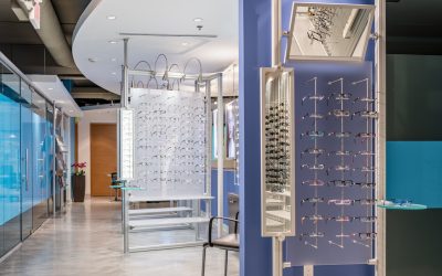
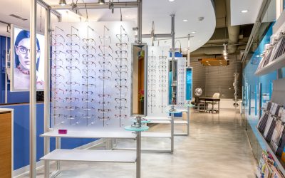
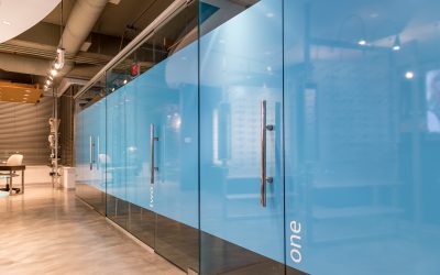
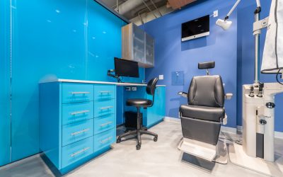
We did not change the positioning of the reception desk or the waiting area but removed walls between the waiting room and the ‘Retail Selling’ space. We kept the original lighting layout, added new LED lamping and some decorative fixtures. We removed the kitchen and sterilizing equipment, the x-ray machine and walls, thereby gaining a wide aisle to showcase eyeglass frames. We added light boxes for current images of eyewear, a Security System, Wireless technology, a Coffee Station, and developed individual Exam and Testing Rooms, some which needed complete darkness and others which did not. We installed glass walls to create new exam rooms, covering them partially with commercial vinyl matching their branding colours. We created an area for contact lens training, which included a sink, mirrors, tables, chairs and technology.
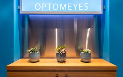
We added a few new chairs as the ones they had were new; re-purposed all the suspended cabinetry into the testing rooms, and then ordered custom cabinetry in a beautiful turquoise with white quartz-stone counter tops.
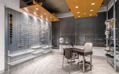
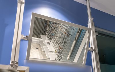
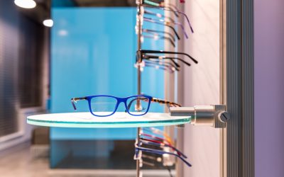
We custom-designed eyeglass frame fixtures with a modular system and included lights onto the system. The biggest challenge was determining the spacing and numbers of frames that each fixture could hold. This entire space is filled with mirrors and installed for both youth and adult heights. We also decided to use corrugated sheet metal as one of the backings for the eyewear. This has been a huge success with its industrial look.
Already this new office is getting rave reviews from both optical clients, other Optometrists, and vendors and we’re proud to have been able to design this National Award-Winning office.
Don't Be Shy. Get In Touch.
If you are interested in working together, send me an inquiry and I will get back to you as soon as I can!

