CHOOSING PAINT COLOURS SEEMS EASY!
You just go to a paint store, pick out some colour chips, place them them on the wall and Voila! That’s the one!
You buy the paint!
ONLY, …to find out that it looks terrible in the room. It doesn’t ‘go’ with anything, it suddenly looks too brown, too green, too blue and heaven forbid, too 80’s dusty rose…!
NOW WHAT!
You can’t return the paint. It’s a custom mix!
You made a mistake that you can’t live with.
I’m here to help you whether this is your Retail, Commercial or Residential space.
About ten + years ago I took a course from Maria Killam – Internationally known colour expert – to become a Certified Colour Expert.
I learned, and continue to learn so much from her.
Check out her site here
What I’m about to show you is ‘just a ‘starter’ but I know it will save you a ton of money, and give you much better insight into the process…and if you’re still confused,
I’d love to help you with an on-site or virtual consultation.
Below… What NOT TO DO!
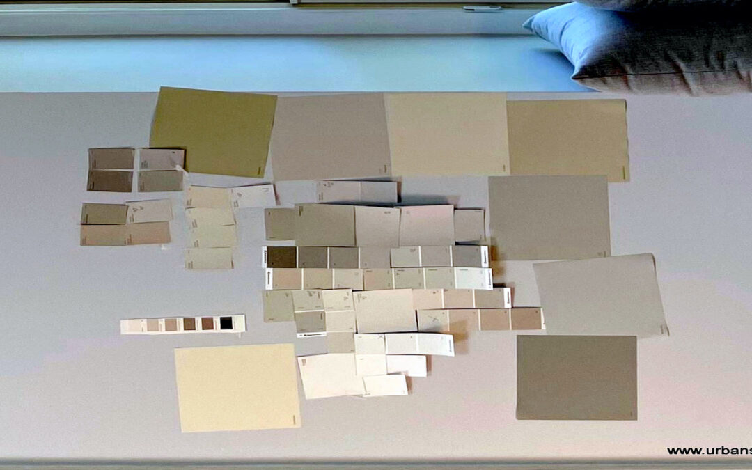
Here are ‘real life images sent to a Designer friend asking for help’. They did exactly what I said above. Went to the paint store…brought home a ton of ‘chips’ or testers pasted or painted them on the bench seating and wall…and hoped they could choose one.
IT WOULD BE IMPOSSIBLE! because Colour always exists in relationships- meaning it looks completely different when it’s surrounded by different colours.


Here are two more photos below that you’ll find interesting.
They are the same paint colour on two different background colours.
Hard to believe isn’t it! They look so different!


Here’s what they SHOULD HAVE DONE when choosing paint colours!
To properly test your colours, paint them up on a large board (Yes, you have to buy a tester/s) and hold the board vertically against all your hard finishes and furnishings. (I have over 100 painted boards of colour from Maria Killam that I use with colour consultations, along with her custom colour wheels…two things I can’t live without)
Isolate the new colour from the old paint colour by placing a WHITE BOARD behind it
(a White Poster board works well for this) so that you are not reacting to the combination of old and new colours.
Below, the person wanted a wall paint colour to work with her existing sofa. It’s suddenly really easy to see which one works best…You all chose the right one…Correct? The left one is too green.


I know that I’ve only given you a BIT of information on choosing colour, but I hope it’s enough to get you thinking about this.
I could have talked about Neutrals, and Undertones and Styling…..but I didn’t want to overwhelm you.
New Colours of the Year 2024 are coming out as I write this.
Colours go in and out of favour about every 10 years but…the way to choose colours for your home or business doesn’t change.
This is all part of what the client is paying for when they hire a professional. People want to know why the colour they have chosen is the right one or why it doesn’t work.
The cost of hiring a professional gets very small when the right colours are chosen in the first place because it costs the same to paint the wrong colour as it does to paint the right one.


Recent Comments