Why sexy?
Anthropologie
Last week I got the opportunity to have a look at the newest stores in Park Royal South Mall, West Vancouver. Most of you will already know that I believe Anthropologie is the leader in Visual Presentation.
Urban Outfitters – The Sexy Sister
I was blown away by how much I loved the design elements and visual presentation at Urban Outfitters. You may not know that Urban Outfitters, Anthropologie and Free People are all owned by the same company – Urban Outfitters Inc. Hence their similarities! I’m not going to talk about their product or controversies in this blog post, but only what I love and why.
The Entry
Urban and Edgy
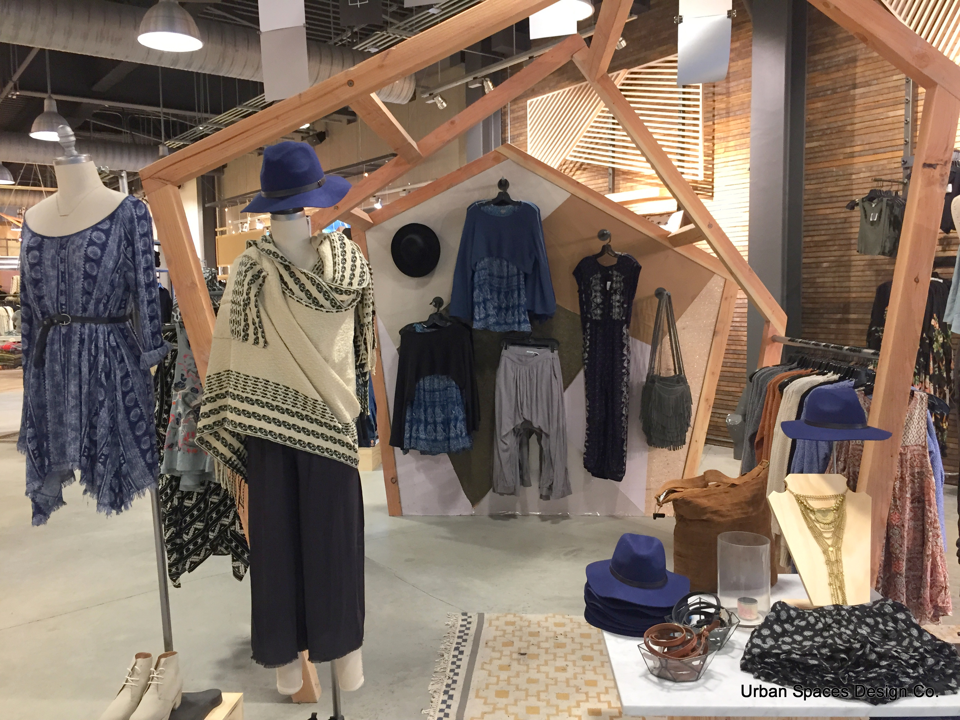
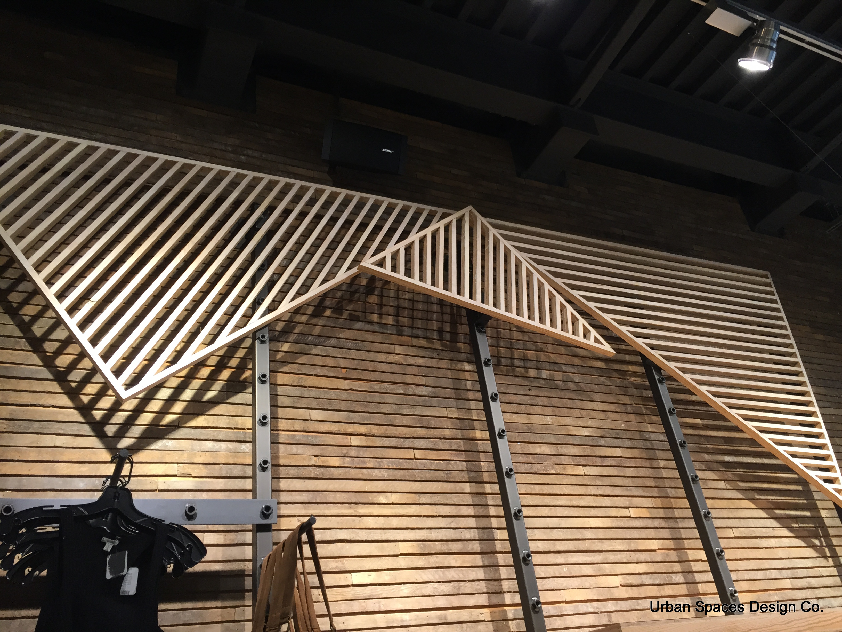
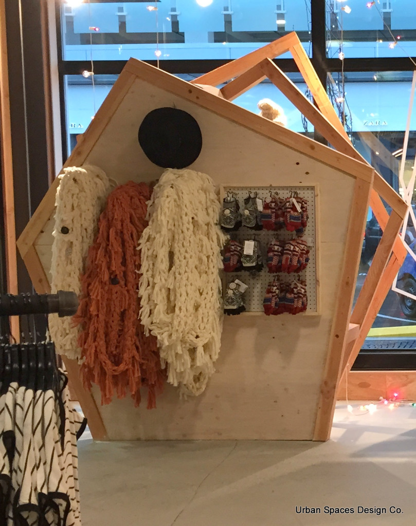
The materials are humble! Plywood, Pegboard, concrete floors, recycled timbers. The Design element of the timber-framed pentagon and triangle is everywhere; from the clothing fixtures to the upper walls . The repeating of the element keeps the store cohesive and interesting. The space is interesting from the floor to the really high ceilings. Have a look at the lighting as well in these images. I’m not a huge fan of cloth Bustforms like these ones but I realize that A, they’re easy for staff to dress, and B, inexpensive, and C – Part of the organic look. If you want a similar look here’s a link to a new fabulous collection by Genesis called Heritage. This comes in both men and women.
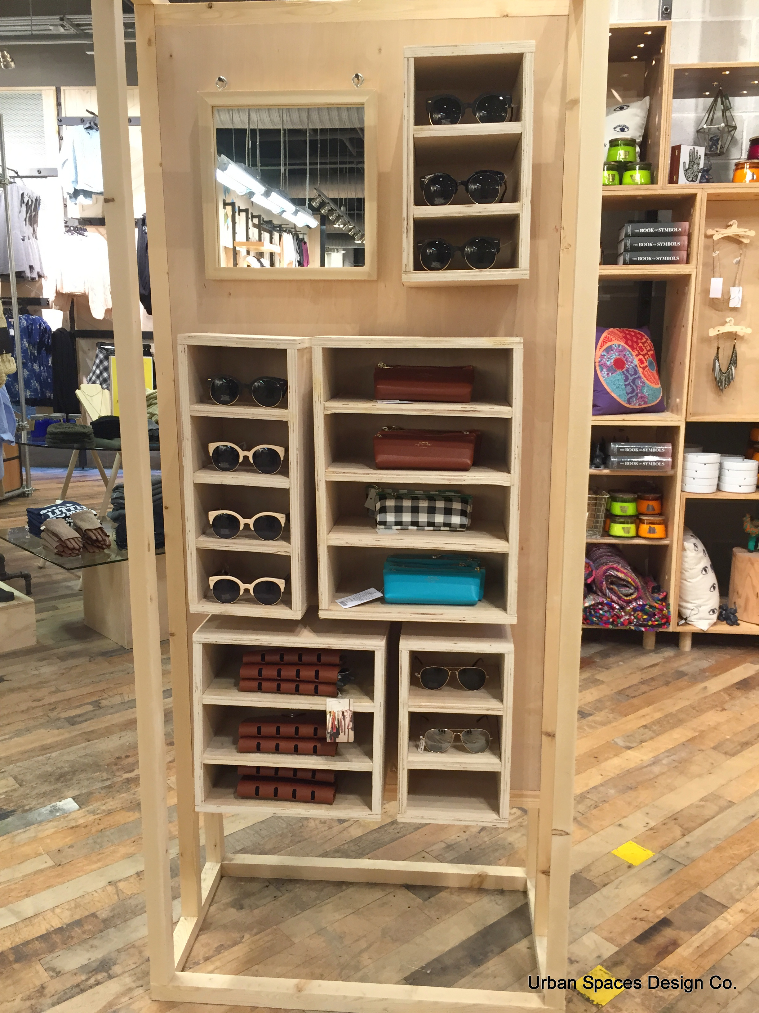
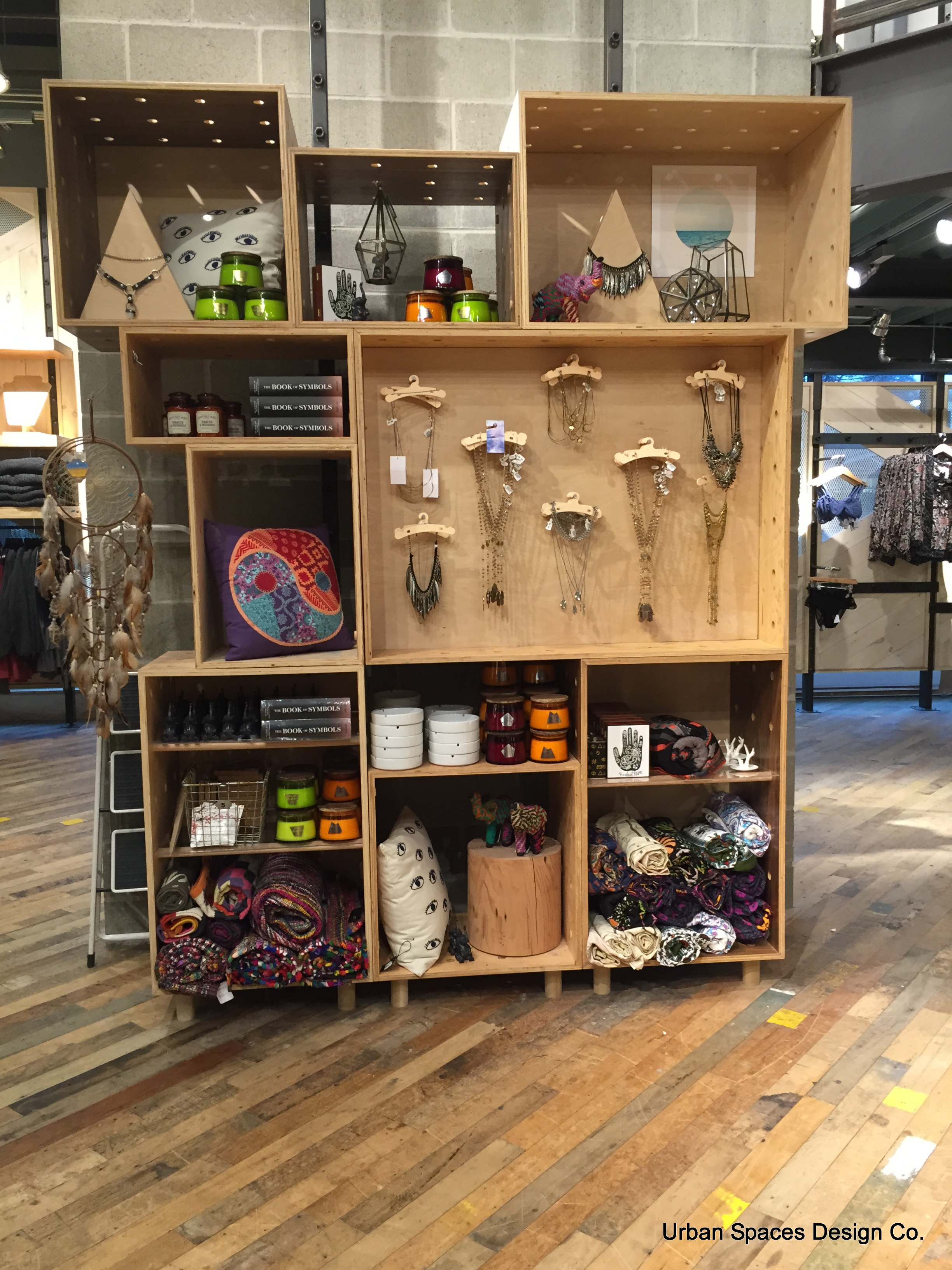
There are boxes for everything. Sunglasses, blankets, lanterns, books, jewellery…
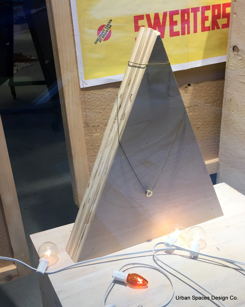
Here’s a close-up of this jewellery merchandiser. Plywood! Triangle!
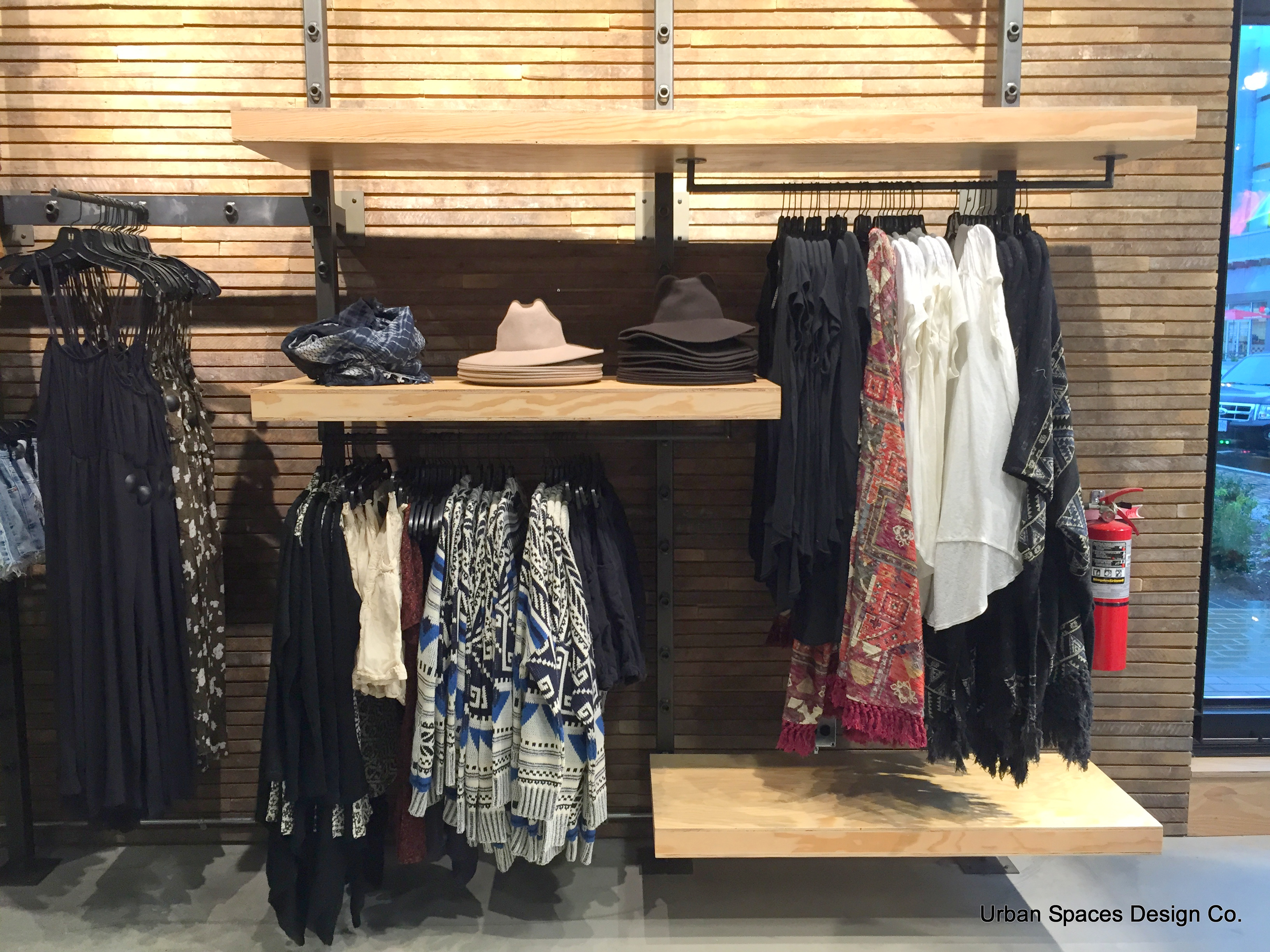
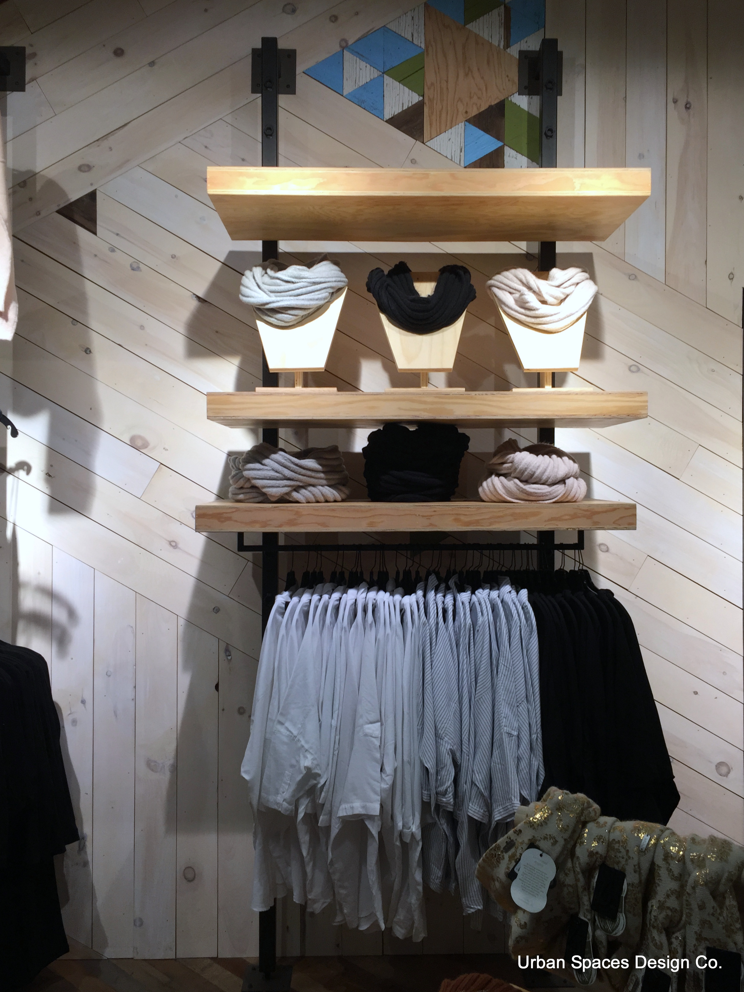
I’m not sure how easy these wall fixtures would move, or how HEAVY they are. But I do like how good they look on the wall, and you’ll notice that their merchandising is correctly done, with the garment front on the left side of the hanger.
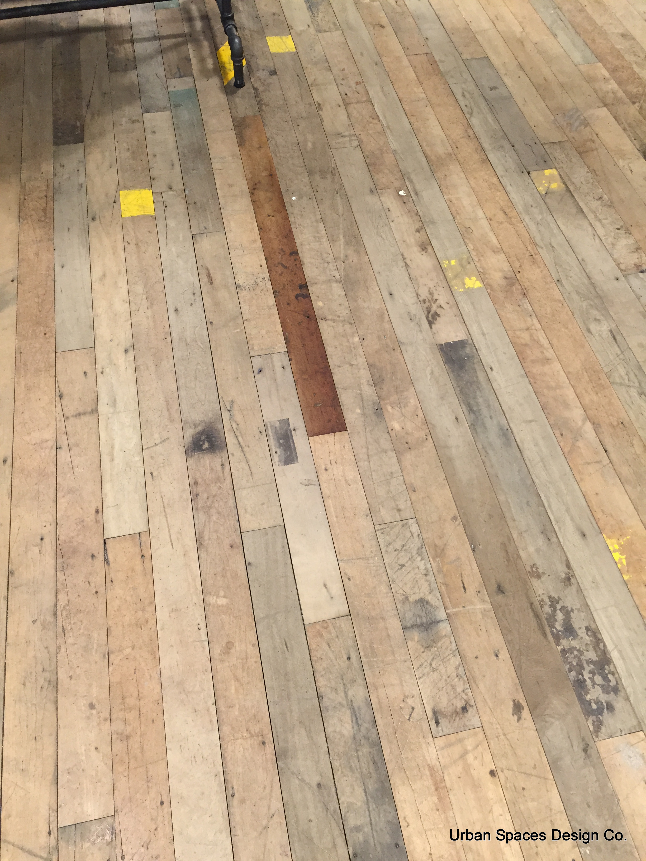
Now check out the floor. Stenciled patterns. Rustic! Don’t worry about your wet shoes in this store! A place where people really can relax.
Yes, the clothing needs a steam! But hey…it’s urban peasant!
What’s really important to notice is the diagonal placement of the planks on the wall, and the repeated stained patchwork design on the walls.
Also, here’s another use of those simple plywood jewellery, accessory stands.
The Cash Desk
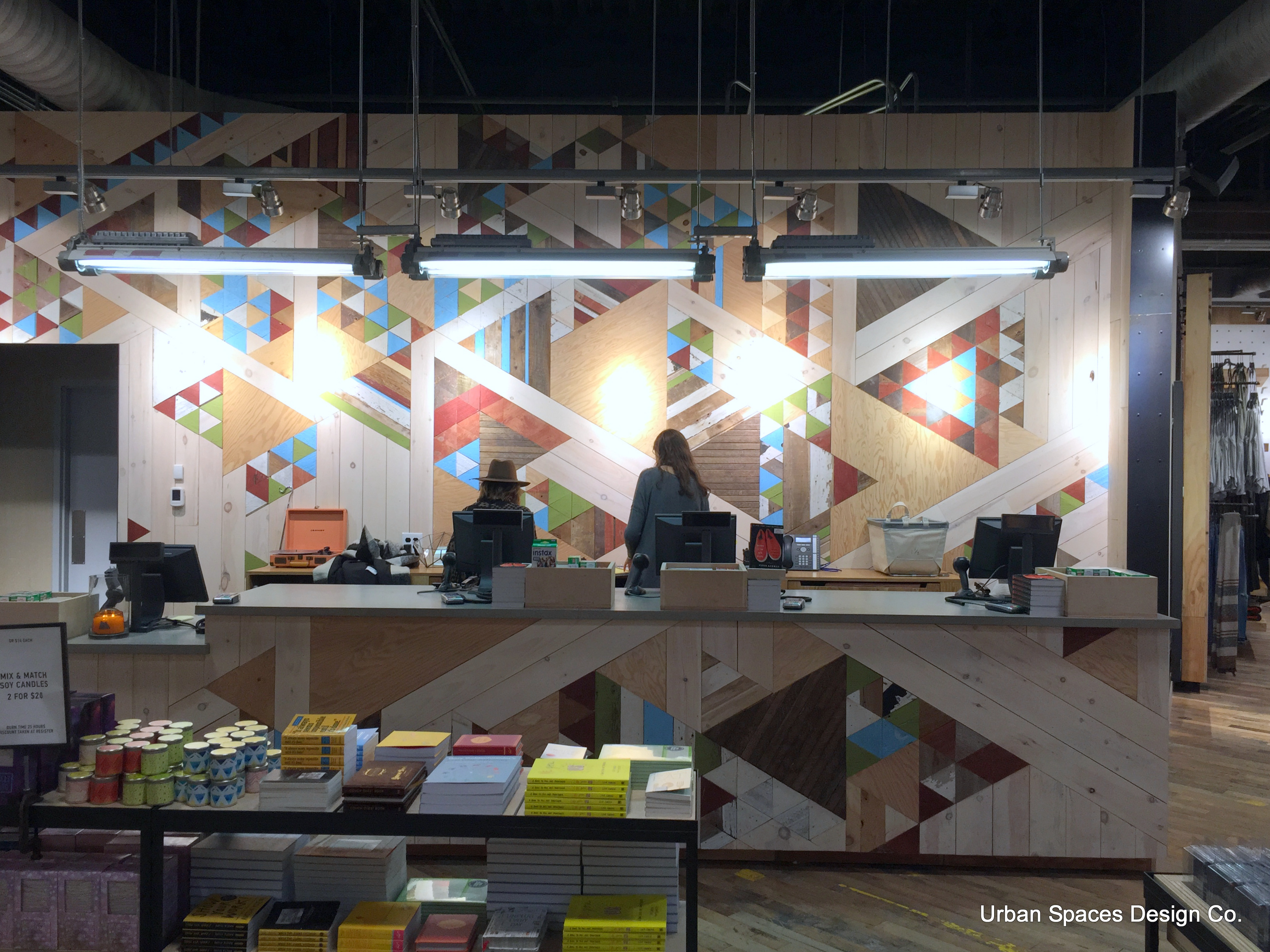
How gorgeous is this? It’s a very large store! The cash desk is on the left side (as it should be) about the middle of the store. Perfect! The patchwork theme continues! There are 4 – I repeat 4 stations here, including a lower ‘accessibility’ one. Not much POP on the desk, but right behind you a table covered in interesting books and candles. This is right at opening 10:00 am, and I’m the first one into the store.
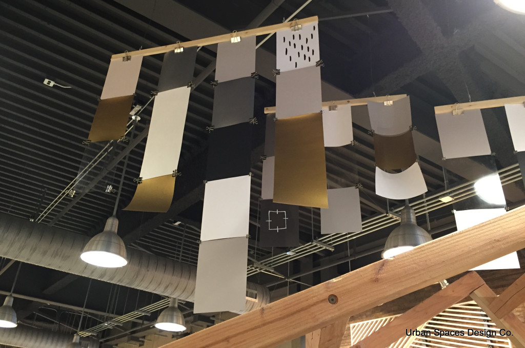
Lets not forget the ceiling space.
These would be SO EASY to duplicate either as a window display element or… on the high ceilings in your store if you have them. Just paper and clips hung on a 1×2″ board!
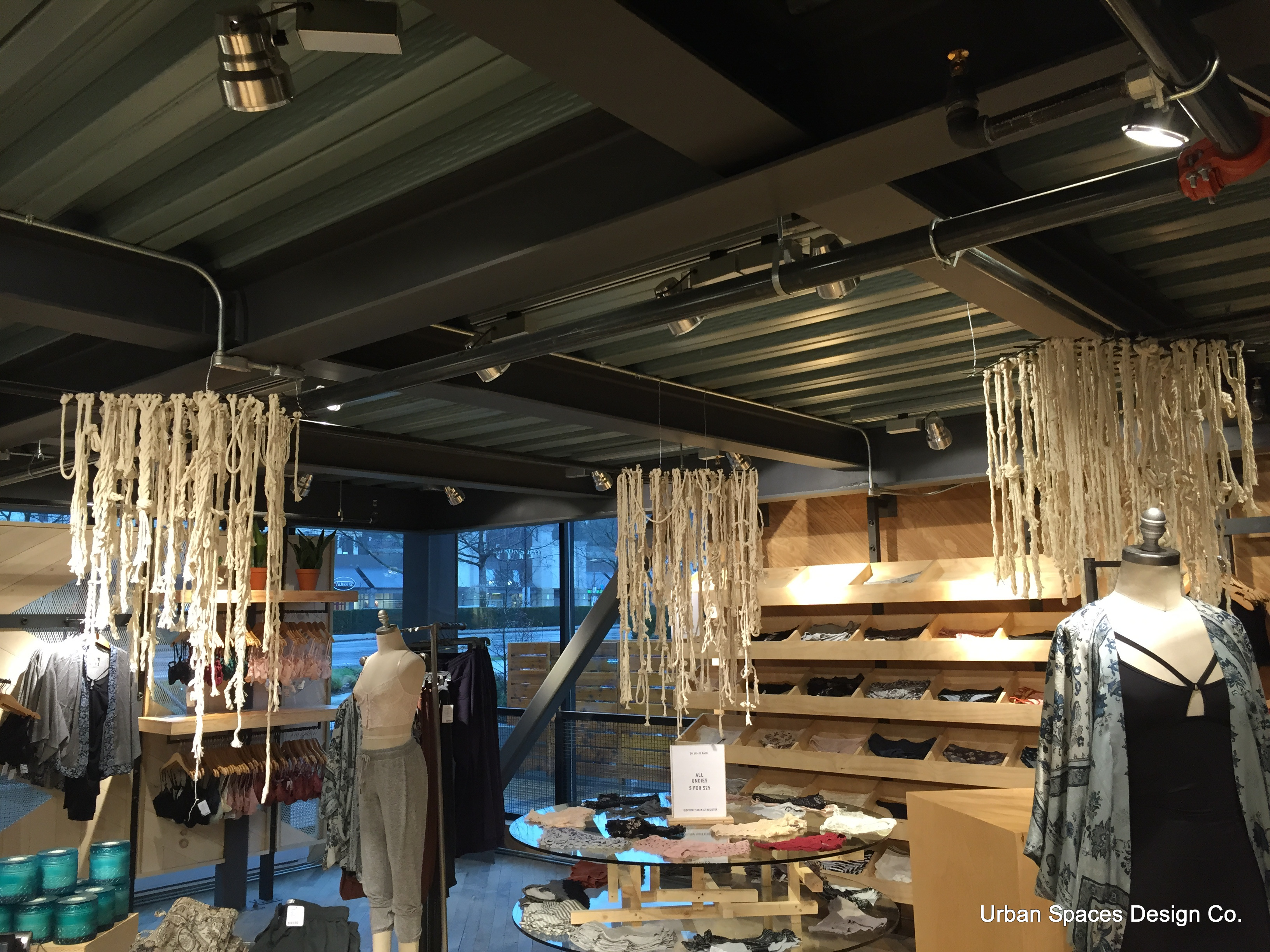
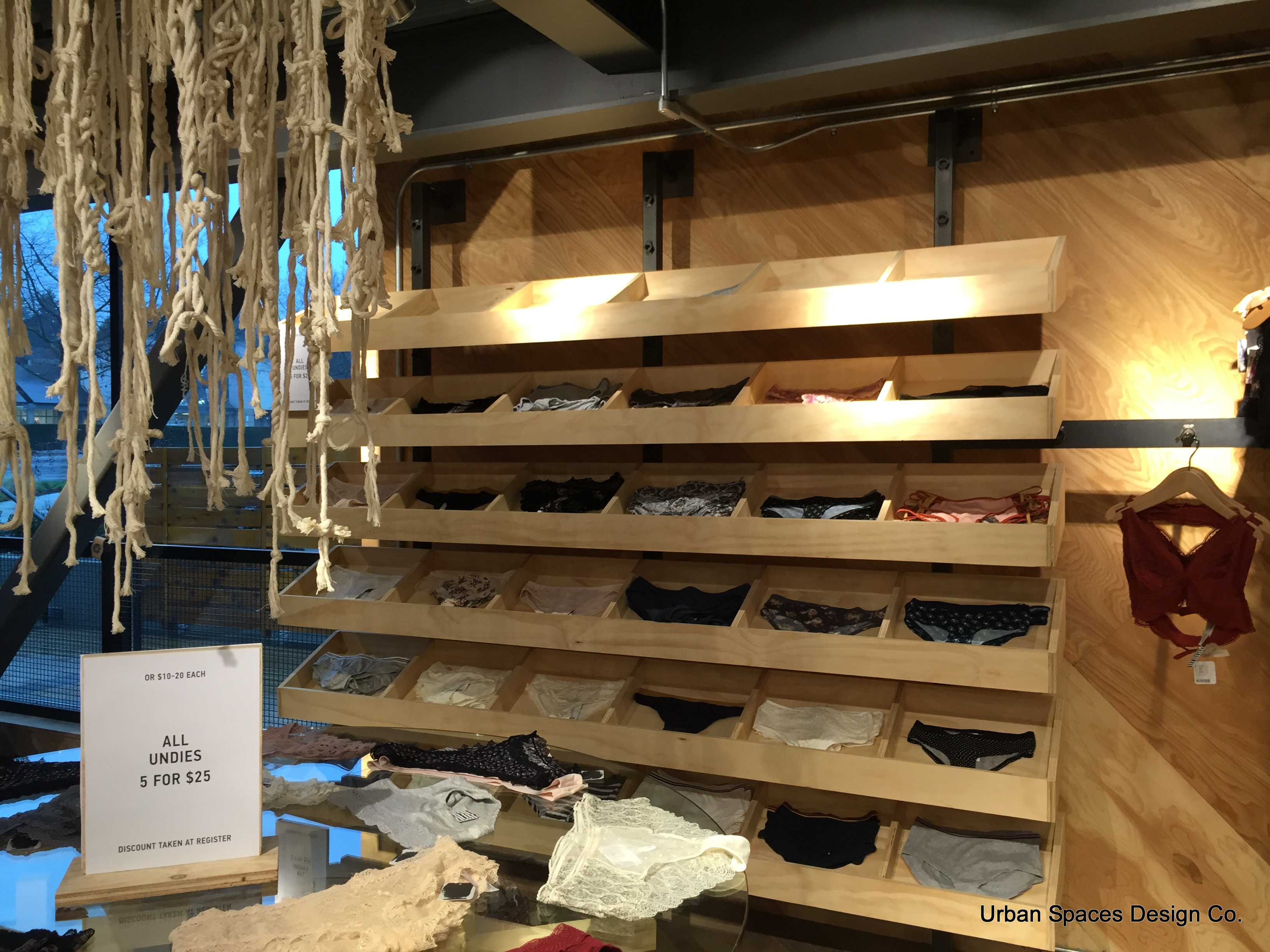
And this image below was just rope tied onto a 2′ x 2′ grid, and then suspended. Not elegant, but definitely edgy.
I think that this set-up could work equally well for so many products. Stuffed toys, sweaters, T-shirts, candles, books…. and so easy to make. A little artistic, and a little eccentric and very ORGANIC!
Easy to aim lights into the angled cubby’s, although we aren’t seeing good aiming here.
Edgy, Kitschy, Bohemian
Call it what you like, but it is really interesting! I hope you’ve loved looking at these images and that they provide inspiration for your store. Everything doesn’t have to be white and shiny!
Stores should reflect who you are!
Thank you so much for following my blogs. Please share them. I’m here to help you!
This all starts with a consultation. I am here to help you grow your business.
What does Urban Spaces Design offer?
We are here to help you as a Consultant, A Designer, and Expert in Visual Presentation and Interior Design. With over 20 years experience we know how to “Get People in the Door, and Make you Money” We work with both large Corporations and Smaller Independents. Every business is important to us!
Call us for help. 604 649 9050 or Email info@urbanspaces.ca

Recent Comments