It’s an exciting time of year when Sherwin-Williams gives designers their Colour forecast for 2022 I thought that in the light of everything that’s happening across British Columbia right now with forest fires raging across our beautiful province that it might be great to have something uplifting to look at in our lives. There is always so much to learn about colour! Sherwin-Williams calls their forecasts ‘Colormix.’ Lets look at the four palettes they are forecasting. METHOD, OPUS, DREAMLAND and EPHEMERA Method Based on Nature – a collection of organic neutrals and tonal luxury. This palette’s earthiness and rich warmth with influences being: art deco • intention • modern organic • postmodernism OPUS This palette of dusky deep tones and unexpected accents was created to be a new kind of classical, to set drama and emotion to the art of good style, and to never, ever fade into the background. Influences: modern maximalism • glam industrial • theater • moody eclectic DREAMLAND A life-giving energy at the start of a new season, with pearlescent tones, new-growth greens, and lavish pinks,
Fashion Merchandising – Dressing a hanger… One of the things I do during a retail consultation is to review merchandising. In a recent consultation it was apparent that a couple tips were needed to bring the level of presentation up a notch. I’m not going to show you the photo but whether it’s women’s or men’s wear, the tips are the same. Yes, I prefer mannequins for showing off clothing, but SOMETIMES a hanger dressing is exactly what’s called for. Think of it as ‘front-facing’ challenges. Merchandising Tip: Tuck Everything into Pockets Note that the pant/skirt hanger is at the correct level for the waist. All sleeves go inside each other and then DEEP into the pockets. You don’t want any ‘limp’ arms. Then Zip up! Above are two types of hangers for dressing an outfit on a hanger. Here’s where I found the left one. I almost always prefer a side hung pant on a hanger presentation. Otherwise you get this ‘bowlegged cowboy’ look seen below. Another benefit is that the look with side hung is ‘tighter
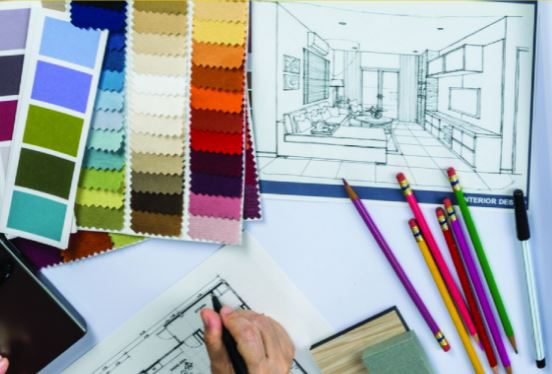
If you are receiving my post for the first time…. thank you for reading! I hope it helps you and if you’d pass it along to your colleagues that would be great! I write about interior design for retail & commercial businesses. With over twenty five years in merchandising and display in both giftware and fashion, and twenty years of retail and commercial design, I have a lot to offer you. This post contains a SPECIAL CONSULTING OFFER, and A PRACTICAL INEXPENSIVE BUSTFORM FOR MEN AND WOMEN. What Do I Believe? I recently watched a YouTube video on What do I believe about what I do and it makes me really pause to think about this. For the next few posts, I’d like to share that with you. You’ve heard the expression “It isn’t Rocket Science”. What’s the big deal? You just make a pretty functioning store!, but in my case I believe that when I am designing retail stores or re-imagining them, that the design thinking approach begins with consumer empathy. I want to problem solve. When you weave

Colour Trends: What’s so important about Sherwin Williams ‘Colour of the Year’? Sherwin-Williams Colour of the Year 2021 is Urbane Bronze Here’s what they say about it. Rooted in Nature “Nature at its simplest and most elemental — embodying the richness of the Earth’s stone, metal and wood — forges a feeling that’s grounded, meditative and serene. Announcing Urbane Bronze SW 7048, the 2021 Sherwin-Williams Color of the Year.” Here’s what my colour expert friend Maria Killam says about it. “I think it is a modern greyed-bronze colour that leans a bit green. It is a softer, warmer alternative to black without being too brown so it still feels current. A grey bronze is a colour I consider to be a fairly safe choice for uncertain times. It is definitely a signal though, that black and charcoal are warming up a bit in the world of colour trends. We all need a bit of stability and comfort, and I can’t think of a more grounded colour.” I think Maria is right on the mark! Below are some great examples of
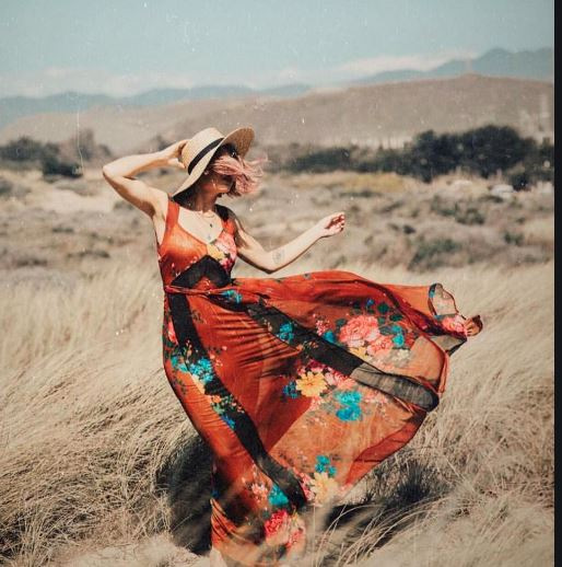
Have you ever noticed when you’re playing on your IPAD and something pops up on the screen that you immediately check it out? What caused you to do that? In one word…..MOVEMENT! It is one of the most important, inexpensive concepts that you can use in your window displays. Let’s have a look! Add MOVEMENT to Window Displays to Attract Customers THE SIMPLE HOUSEHOLD FAN! I’ve used this concept so many times, because it works for so many products. Just the slightest movement catches peoples eyes. Attract Retail Customers with Ceiling Motors It doesn’t matter if you’re suspending a mirror ball like the ones in the image below. These simple motors can make a clothing hanger turn, an umbrella, a single flower….anything really that you can imagine..and, they’re inexpensive. The Turntable Or simply put… rotating display stands. This was a promotion done at Park Royal West Vancouver a few years ago, where mannequins were placed on these rotating display stands along with signage to promote the products. They were really effective! Often used for photography purposes, these would work equally
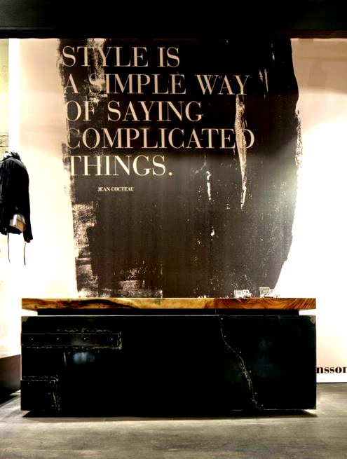
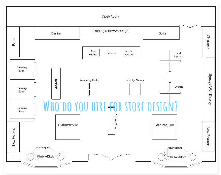
Let’s Look at the Cash Desk Position At a recent consultation one of the things that became apparent is that the cash desk was likely in the wrong place . Let’s look at my simple sketch. Let’s Look at a Few Retail Design Photos Simple & Beautiful Here’s the first article that I wrote back in 2014. You may want to check it out.. LIFE ON THE LADDER CASH DESKS. Here’s a ‘freebie’ for you just for reading my blogs. If you think that you may have a cash desk concern regarding placement… send me a photo and we’ll discuss it. It is rare to have a Retail Designer with extensive Professional Merchandising experience. That’s what you get when I’m your Designer! ‘Expert knowledge of how customers interact in a shopping environment with the goal of selling products and at the same time creating a personal brand statement for the client..’ Give me a call. Let’s talk about your project. 778 340 8585 GET IN TOUCH BY EMAIL
Now let’s look at just a couple of images to prove the points from the article. It is rare to have a Retail Designer with extensive Professional Merchandising experience. That’s what you get when I’m your Designer! ‘Expert knowledge of how customers interact in a shopping environment with the goal of selling products and at the same time creating a personal brand statement for the client..’ Give me a call. Let’s talk about your project. 778 340 8585 GET IN TOUCH BY EMAIL
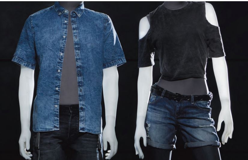
MANNEQUINS: THE SILENT SELLERS IN RETAIL I’m often asked about mannequins during consultations. Here are some very ‘tongue-in-cheek’ reasons why mannequins can be your best employees. You don’t have to pay them any benefits, UIC, holiday pay. In fact… They don’t take holidays. They don’t talk back. They always show up on time. You don’t have to train them! They don’t take sick leave. They work in the windows when you’re closed. They’re emotionally stable. They don’t have opinions on how you’re running your company, They don’t try to take ownership of your company. They don’t make personal phone calls while they’re working They always dress brand appropriate. Dear readers… I’m not suggesting that mannequins replace real live people but I wanted to let you know that there are some real benefits to having bust forms or mannequins in your stores. Here are some of their qualities and differences. Mannequins cost approximately $600.00 – $1800.00 whereas bust forms cost approximately $200.00 – $400.00. Mannequins come in all shapes, sizes, make-up or not, hairstyles…just like people! By the way…Arms and legs are
Retail Dressing Rooms Hang Bars When I started writing this blog post, I thought that I would only write about hang bars and seating. Hang bars are a big challenge. What height do I put them, How many do I want? What’s the style and so on. With seating, really it’s anyone’s brilliant ideas that can work, whether it’s a vintage stool, or a custom tufted ottoman. Then, after I had researched what I had in my own photo inventory I though I’d check the web for additional photos. What I discovered was a wealth of incredible images, some of which I’ll put in this blog. I hope that I’ll inspire you to look at your own dressing rooms, and possibly make some changes. In this photo below, you will see all types of hang rods. Doubles, singles, and so on… We know that hangers can really affect the condition of the wall behind it, so it is really worth considering what you do with them. You should always ask ‘How long are my garments?’. That will dictate how high you place
The Triangle Principle (Merchandising Education) I am really fortunate to be a guest blogger on the Talented and Brilliant Maria Killams’ blog site. With her permission I used a couple of her photos in the guest posting to demonstrate one of the key ‘Principles of display’. I’ve known Maria for some time now, first meeting her at a Canadian Decorators event where she was a guest presenter. Maria Killam is an internationally sought after colour expert, design blogger, author, trainer, decorator and stylist. She is passionate about all things colour and design, subjects she writes about extensively on her blog, Colour Me Happy. Here’s my guest post on The Triangle Principle….featured on Maria’s blog. Style your Home like the Pros by using the Triangle Principle I hope you have found this post inspiring and thought provoking, and if you want to find out more about what I do please visit me at Urban Spaces Design Co. I can help you if you are seeking full design services including consulting, merchandising, store design and more. Please contact us at 604 649 9050 or email


Recent Comments