WHY IS STORE LAYOUT IMPORTANT? STORE LAYOUT & MERCHANDISING DIRECTLY AFFECTS YOUR STORE TRAFFIC, HOW MUCH TIME CUSTOMERS SPEND IN THE STORE… AND… YOUR SALES. Most of the time I’m working with a renovation and not new builds when it comes to retail design work. One of the very first things I do is come up with a space plan…which would include where we’re going to put things, and equally important, how will the customer get to it! Let’s explore 8 ideas! #1 Use the Right Floor Plan There are several types of floor plans which direct traffic flow through your space. The most common are: Straight – Shelving & racking are placed in straight lines and often seen in large retail spaces…think supermarkets…up and down the aisles Racetrack or a Loop Plan – down one side and back the other…a ‘loop’ Free flow Plan – This one encourages customers to browse in any direction Here’s the best link I’ve found which describes them all and why they work. https://www.creativedisplaysnow.com/types-retail-store-layouts/ See if you can identify which one of these are
How do you shave store renovation expenses when times are tough? A few years ago a Hair Salon and Spa called Spa Rivier in Quesnel, British Columbia decided to open a women’s fashion store when the store next door became available. This all went well until Covid 19 showed it’s ugly face. Store closures, staffing commitments, Rigid rules, Back Orders to Non Shipping of orders…If you’re in retail, you will all know this well! Over the past fifteen years I have had the pleasure of working with Donna, the owner, on various store design and merchandising projects. I got a call in January asking for my help. She wanted to find a way to have one cash centre manage both the Salon side and the Boutique side. Currently there were two, meaning that staffing had to happen in both places at all times. She also realized that sight lines were going to be critical to see both sides of the store. This post is about how we went about this. VIRTUALLY! We started with tons of photos and measurements. Here’s
It’s an exciting time of year when Sherwin-Williams gives designers their Colour forecast for 2022 I thought that in the light of everything that’s happening across British Columbia right now with forest fires raging across our beautiful province that it might be great to have something uplifting to look at in our lives. There is always so much to learn about colour! Sherwin-Williams calls their forecasts ‘Colormix.’ Lets look at the four palettes they are forecasting. METHOD, OPUS, DREAMLAND and EPHEMERA Method Based on Nature – a collection of organic neutrals and tonal luxury. This palette’s earthiness and rich warmth with influences being: art deco • intention • modern organic • postmodernism OPUS This palette of dusky deep tones and unexpected accents was created to be a new kind of classical, to set drama and emotion to the art of good style, and to never, ever fade into the background. Influences: modern maximalism • glam industrial • theater • moody eclectic DREAMLAND A life-giving energy at the start of a new season, with pearlescent tones, new-growth greens, and lavish pinks,
Fashion Merchandising – Dressing a hanger… One of the things I do during a retail consultation is to review merchandising. In a recent consultation it was apparent that a couple tips were needed to bring the level of presentation up a notch. I’m not going to show you the photo but whether it’s women’s or men’s wear, the tips are the same. Yes, I prefer mannequins for showing off clothing, but SOMETIMES a hanger dressing is exactly what’s called for. Think of it as ‘front-facing’ challenges. Merchandising Tip: Tuck Everything into Pockets Note that the pant/skirt hanger is at the correct level for the waist. All sleeves go inside each other and then DEEP into the pockets. You don’t want any ‘limp’ arms. Then Zip up! Above are two types of hangers for dressing an outfit on a hanger. Here’s where I found the left one. I almost always prefer a side hung pant on a hanger presentation. Otherwise you get this ‘bowlegged cowboy’ look seen below. Another benefit is that the look with side hung is ‘tighter

If you are receiving my post for the first time…. thank you for reading! I hope it helps you and if you’d pass it along to your colleagues that would be great! I write about interior design for retail & commercial businesses. With over twenty five years in merchandising and display in both giftware and fashion, and twenty years of retail and commercial design, I have a lot to offer you. This post contains a SPECIAL CONSULTING OFFER, and A PRACTICAL INEXPENSIVE BUSTFORM FOR MEN AND WOMEN. What Do I Believe? I recently watched a YouTube video on What do I believe about what I do and it makes me really pause to think about this. For the next few posts, I’d like to share that with you. You’ve heard the expression “It isn’t Rocket Science”. What’s the big deal? You just make a pretty functioning store!, but in my case I believe that when I am designing retail stores or re-imagining them, that the design thinking approach begins with consumer empathy. I want to problem solve. When you weave

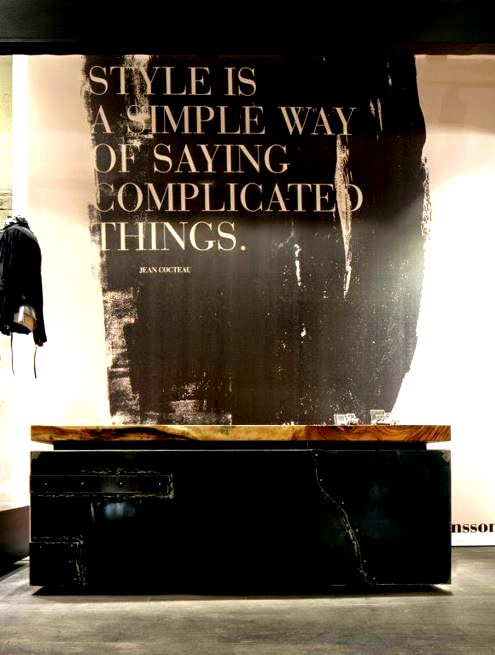
Let’s Look at the Cash Desk Position At a recent consultation one of the things that became apparent is that the cash desk was likely in the wrong place . Let’s look at my simple sketch. Let’s Look at a Few Retail Design Photos Simple & Beautiful Here’s the first article that I wrote back in 2014. You may want to check it out.. LIFE ON THE LADDER CASH DESKS. Here’s a ‘freebie’ for you just for reading my blogs. If you think that you may have a cash desk concern regarding placement… send me a photo and we’ll discuss it. It is rare to have a Retail Designer with extensive Professional Merchandising experience. That’s what you get when I’m your Designer! ‘Expert knowledge of how customers interact in a shopping environment with the goal of selling products and at the same time creating a personal brand statement for the client..’ Give me a call. Let’s talk about your project. 778 340 8585 GET IN TOUCH BY EMAIL


Recent Comments