Community-Focussed Office Space Design
DIVERSEcity Community Resources Society empowers newcomers and other diverse communities to build the life they want in Canada. Their free, multilingual programs and services in language, settlement, employment and counselling provide newcomers with a foundation of information, skills and connections to achieve their goals.
This is a vibrant active society which was not visible in their commercial office space. It was a great space but there was no branding of colour or graphics. We were excited to be part of this.
Office Renovation Planning
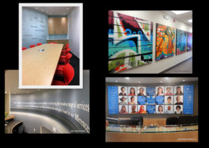
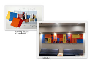
We started by creating a primary palette of blue, yellow, orange and red and incorporated the Canadian Maple Leaf in all graphics. A Donor wall with changeable panels was placed over the entry seating on a custom Canadian-made fixture system. We took their key words from their mission statement and placed them within the wall. Words like ‘Care, Leadership, Innovation and Resilience’. Behind the reception desk we incorporated their Mission Statement amidst professional photographs of some of their staff and clients. What had been a dull taupe now had a brilliance to it.
On the opposite wall, though not seen in these images was a very large metal world map which allowed visitors to place a small magnet on their homeland. The clients loved the interactivity of this.
Behind the reception area, again not seen, was an open room with wall-mounted brochure racks, computer desks and a wall-to-wall flowing graphic of vibrant colour, once again tying in the Brand Message.
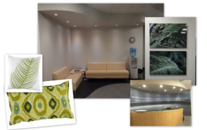
On the second floor reception area we custom-designed a wall-to-wall graphic with their Mission Statement, and added some cushions and artwork, all with the intention of making it a ‘welcoming’ space.
The long narrow boardroom behind the curved reception area needed storage This was incorporated in the space planning at the end of this unusual-shaped space in the form of a counter with cabinets above and below… A new boardroom table with power and data ports was purchased, along with high quality bright red seating on wheels. The walls were painted and inspiring words were placed on the wall in a metallic vinyl.
Down the hall from the second floor reception, and directly across from the elevators we commissioned four large graffiti canvases. This continues the vibrant Commercial Design concept. This is a Happy Place, where dreams are made and I feel very fortunate to have been able to work with them!
Don't Be Shy. Get In Touch.
If you are interested in working together, send me an inquiry and I will get back to you as soon as I can!


