Designing a New Retail Store
Renovation from Fashion to Specialty Foods
It was especially exciting to be asked by a fellow designer to design her Olive Oil & Vinegars store as she knew that I specialized in retail and she didn’t want to make mistakes in its design that would affect sales. Such a compliment!
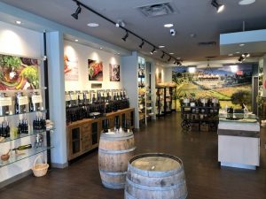
This store was initially selling fashion. We kept the layout of the store other than the back wall where there is now a mural of an olive grove. That area had been changing rooms. We closed off the changing rooms and opened them up from behind and they are now currently used for storage.
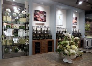
We left the cubbyholes where they were and were able to find ready-made cabinets that fit perfectly within the space. They are the perfect height for ‘tastings’ and provided storage below. A great find!
Contemporary Store Design Trends
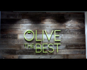
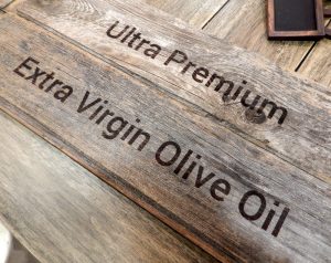
The client was also able to obtain old weathered fence boards which were used behind the cash desk, on the window platforms, but also for their signage. The Brand vision certainly drove the signage choice with the aged tradition of burned laser printing. There is a freshness to this! Picture frames were included in the signage package for changeable imagery.
On the remaining walls we used a very modern, modular Made-In-Canada fixture system to create new shelving for giftware products.
New LED track lighting was installed where needed and a fabulous rustic wagon wheel chandelier was placed over a very long harvest table. The table was placed in front of the mural so that special event parties could feel like they were dining alfresco overlooking olive orchards. Reclaimed Douglas fir rounds were used for seating.
Good retail design is definitely the key to sales.
Don't Be Shy. Get In Touch.
If you are interested in working together, send me an inquiry and I will get back to you as soon as I can!


