Risers and other things!
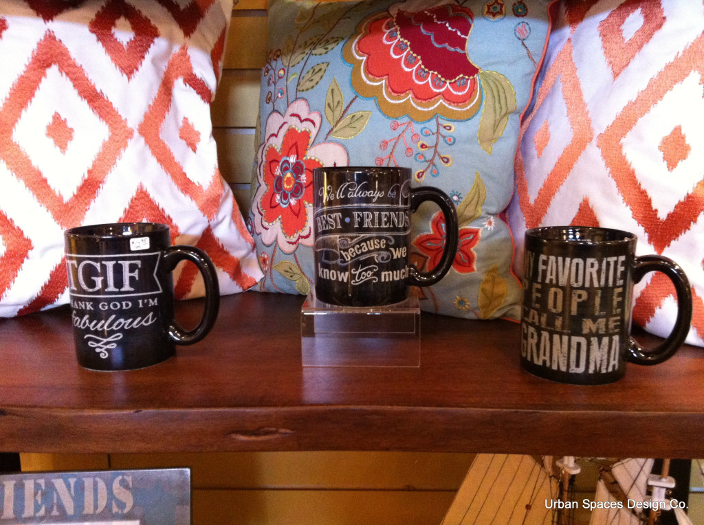
What’s wrong with this merchandising?
Yes, I love the mugs and…I love the cushions, but they have NO connection. You will sell more product if you ‘Tell a story’.
Here are your choices.
-
You can put all the mugs together in an area
-
You can put all the cushions in an area or…
-
You can tell a story with Chairs, Cushions, Breakfast nook, Coffee beans…
What I really dislike.
-
In the image above, they have chosen to put the cushions up against the dreaded slot wall – possibly to hide it. Cushions generally go into a cabinet or showcase sideways or they are used in a ‘setting’.
-
They’ve used a ‘RISER’. Whatever for? Risers should only be used to elevate product when it wouldn’t otherwise be seen. Professionals will use risers only as a last resort!
-
The price tag is placed front and centre on the mug. In my opinion the price tag should be on the bottom of the mug, where it doesn’t distract from the message. It makes customers pick it up to see if they like the weight and design, and the last piece is the price on the bottom.

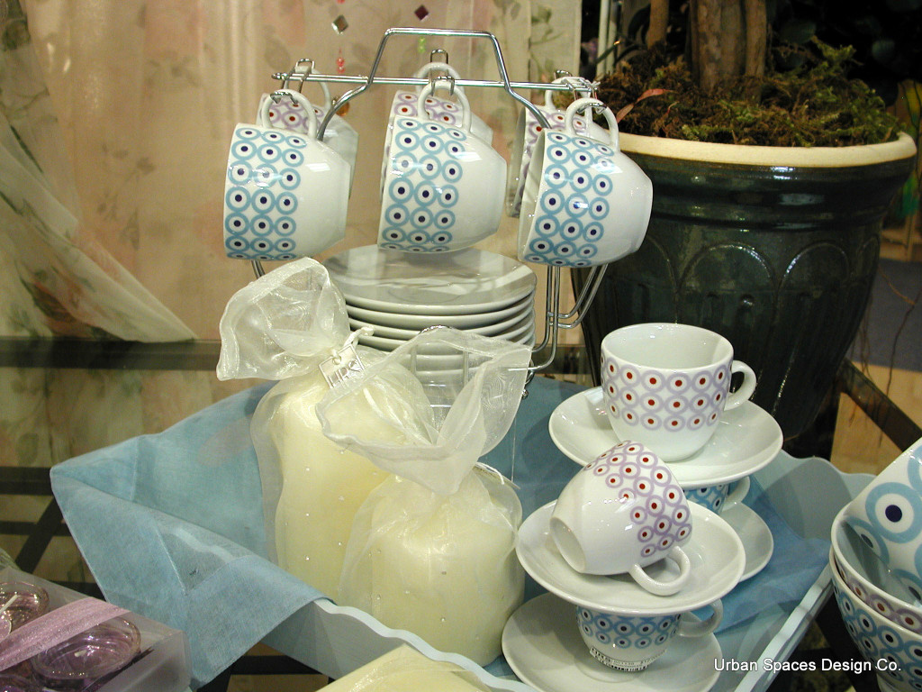
Here we’re telling a story. Breakfast, Summer, Candles, and Patio. Selling an ‘experience’ sells product!

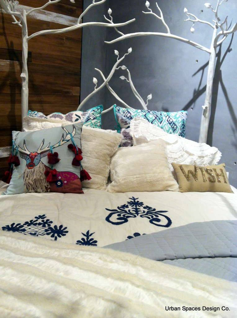
Don’t you just want to jump into this bed? If you were the customer wouldn’t you want all of these cushions?


Recent Comments